Frontend Architecture Overview
Introduction
The Scoriet frontend is a modern React 19 application built with TypeScript and Inertia.js, providing a multi-document interface (MDI) for code generation and enterprise development workflows. The architecture emphasizes code splitting, lazy loading, and responsive component-based design.
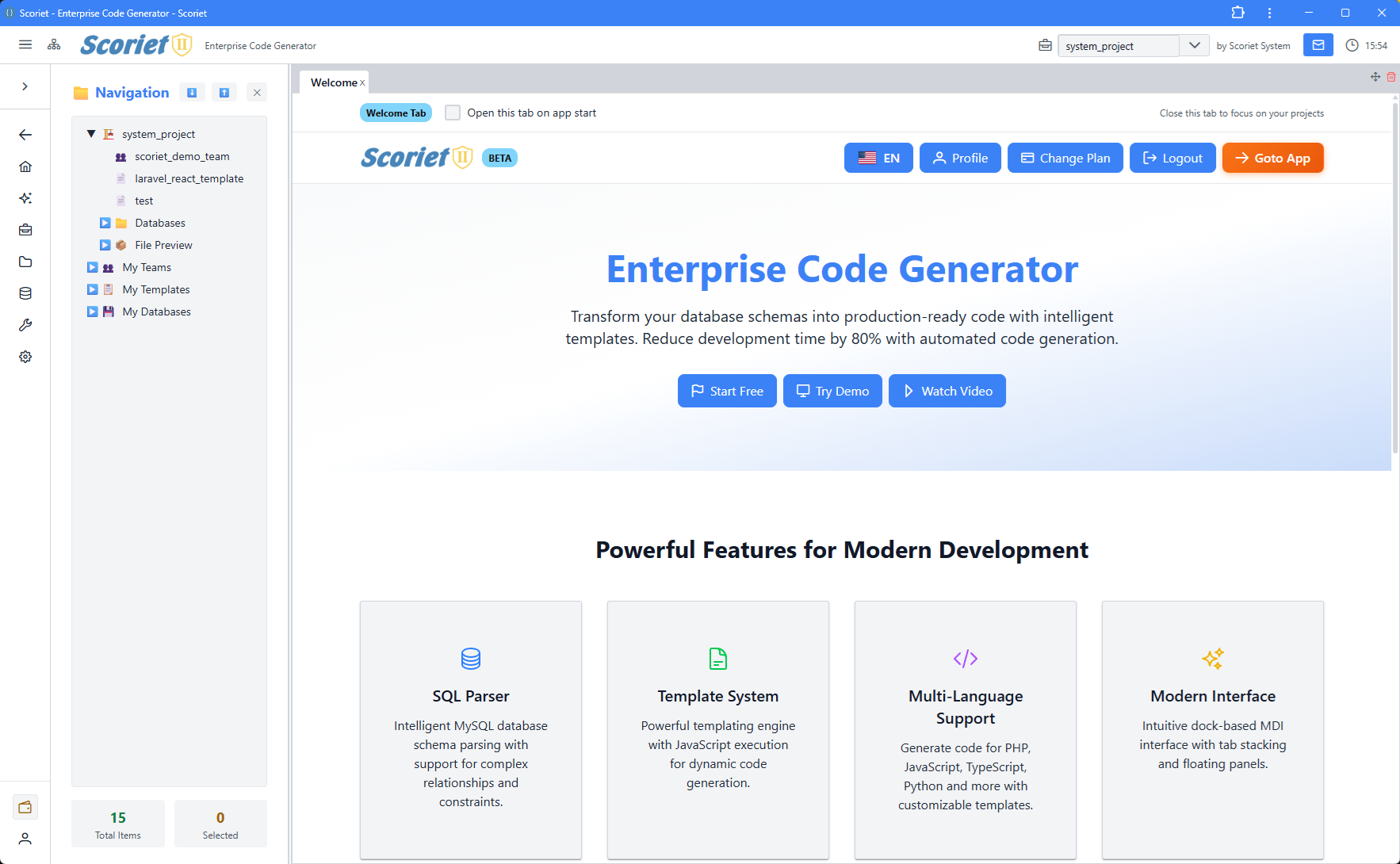 Scoriet frontend with rc-dock MDI interface, navigation tree, and multiple tabbed panels
Tech Stack
| Technology | Purpose | Version |
|---|---|---|
| React | UI framework | 19 |
| TypeScript | Type safety | Latest |
| Inertia.js | Server-React bridge | 2.0 |
| Tailwind CSS | Styling | 4.0 |
| Vite | Build tool | 7.0 |
| PrimeReact | UI components | Latest |
| RC Dock | MDI interface | Latest |
| XyFlow | Diagram editor | Latest |
| dnd-kit | Drag & drop | Latest |
| CodeMirror | Code editor | Latest |
| Chart.js | Data visualization | Latest |
| Quill | Rich text editor | Latest |
| i18next | Internationalization | Latest |
| React Hook Form | Form management | Latest |
| React Hotkeys Hook | Keyboard shortcuts | Latest |
Project Structure
resources/js/
├── app.tsx                    # Inertia app bootstrap & providers
├── pages/                     # Page components
│   ├── Index.tsx             # Main MDI application
│   ├── LandingPage.tsx       # Public landing page
│   ├── EmailVerification.tsx # Email verification flow
│   ├── ProjectInvitationResponse.tsx
│   ├── PaymentResult.tsx
│   └── PublicProjectPage.tsx
├── Components/               # Reusable components
│   ├── Panels/              # 57+ lazy-loaded panel components
│   ├── AuthModals/          # Login, register, auth flows
│   ├── Modals/              # Application modals
│   ├── TopBar.tsx           # Top navigation
│   ├── ClassicTreeView.tsx  # Tree view component
│   └── Common/              # Shared utilities
├── contexts/                # React contexts
│   ├── ProjectContext.tsx   # Project & edit lock state
│   ├── ThemeContext.tsx     # Theme & colors
│   └── ToastContext.tsx     # Toast notifications
├── lib/                     # Core libraries
│   ├── api.ts              # API client
│   ├── echo.ts             # Real-time (Laravel Echo)
│   └── pushNotifications.ts # Push notification handling
├── services/                # Business logic services
├── styles/                  # Global styles
├── types/                   # TypeScript definitions
├── utils/                   # Helper functions
└── i18n/                    # Internationalization
Application Bootstrap
The application initializes through app.tsx, which:
- Loads pricing data - Fetches and caches pricing info on startup
- Wraps providers - Applies context providers in order:
ThemeProvider- Global theme & colorsToastProvider- Toast notification systemProjectProvider- Project selection & real-time locks
- Renders Inertia app - Server-driven page rendering
- Configures progress bar - Shows navigation progress
// resources/js/app.tsx excerpt
<ThemeProvider>
  <ToastProvider>
    <ProjectProvider>
      <App {...props} />
    </ProjectProvider>
  </ToastProvider>
</ThemeProvider>
Page System
Scoriet uses Inertia.js to manage pages, providing seamless server-client communication:
Main Pages
- Index.tsx - The core application with MDI dock layout, handles all authenticated user interactions
- LandingPage.tsx - Public-facing marketing page
- EmailVerification.tsx - Email confirmation flow
- ProjectInvitationResponse.tsx - Project invite acceptance
- PaymentResult.tsx - Payment processing feedback
- PublicProjectPage.tsx - Public project viewing
Component System
Always-Loaded Components
- NewNavigationPanel - Top navigation bar with menus
- TopBar - Secondary navigation
- AuthModalManager - Authentication modal orchestration
Lazy-Loaded Panels (Code Splitting)
57+ panel components are lazy-loaded using React.lazy() for optimal performance:
const PanelT1 = lazy(() => import('@/Components/Panels/PanelT1'));
const FormDesignerPanel = lazy(() => import('@/Components/Panels/FormDesignerPanel'));
// ... 55+ more panels
Benefits:
- Only loaded when opened
- Reduces initial bundle size
- Improves startup time
- Wrapped in
<Suspense>with fallback UI
Panel Categories
Core Navigation:
- PanelT1 (Sidebar tree)
- PanelT2 (Main content)
- ProjectPanel
- MyApplicationsPanel
Designers:
- FormDesignerPanel
- ReportPatternDesignerPanel
- ReportLayoutDesignerPanel
- FormLayoutDesignerPanel
Management:
- TemplateManagementPanel
- TemplateStorePanel
- DatabaseManagementPanel
- ProjectSettingsPanel
Collaboration:
- MessagingPanel
- TeamManagementPanel
- KanbanBoardPanel
- InviteManagementPanel
Development:
- CodeGenerationPanel
- DebugManualGeneratorPanel
- DeploymentLogPanel
- CodeAdjustmentsPanel
Admin & System:
- SystemSettingsPanel
- LanguageManagementPanel
- PerformanceMetricsPanel
- PayoutAdminPanel
Context System
Contexts provide global state management without prop drilling:
ThemeContext
Manages application theming and color schemes.
interface ThemeContextType {
  colors: ColorScheme;
  isDarkMode: boolean;
  setIsDarkMode: (isDark: boolean) => void;
}
ProjectContext
Manages selected project, project list, and collaborative edit locking.
interface ProjectContextType {
  projects: Project[];
  selectedProject: Project | null;
  setSelectedProject: (project: Project | null) => void;
  loadProjects: () => Promise<void>;
  editLock: EditLockState | null;
  acquireLock: (projectId: number) => Promise<boolean>;
  releaseLock: (projectId: number) => Promise<void>;
}
ToastContext
Provides toast notifications API.
interface ToastContextType {
  showSuccess: (message: string) => void;
  showError: (message: string) => void;
  showInfo: (message: string) => void;
}
State Management Patterns
Local Component State
Used for UI state that doesn't need to be shared:
- Modal visibility
- Loading states
- Form input values
- Temporary selections
Context State
Used for application-wide state:
- Current theme
- Selected project
- User authentication
- Edit locks (real-time collaboration)
Server State (Inertia)
Props passed from Laravel controller to page component. Automatically cached and invalidated.
API Communication
The apiClient provides typed API communication with automatic token management:
import { apiClient } from '@/lib/api';

// Auto-includes Bearer token, handles auth errors
const projects = await apiClient.getProjects();
const result = await apiClient.createProject(data);
Internationalization (i18n)
Multi-language support via i18next:
import { useTranslation, getStoredLanguage } from '@/i18n';

const { t } = useTranslation(getStoredLanguage());
const message = t.keyname; // Translation key from i18n files
Supported Languages:
- Configured in i18n folder
- Language selection stored in localStorage
- Auto-detects user preferred language
Error Handling
Error Boundaries
React error boundaries catch component rendering errors:
<ErrorBoundary FallbackComponent={ErrorFallback}>
  <LazyPanel />
</ErrorBoundary>
API Error Handling
API client automatically handles:
- 401 Unauthorized - Redirects to login
- 403 Forbidden - Shows permission error
- Network errors - Retry logic with exponential backoff
- Token refresh - Automatic JWT refresh
Performance Optimizations
- Code Splitting - 57 panels lazy-loaded on demand
- Suspense - Loading fallbacks for async components
- Memoization - React.memo for expensive components
- useCallback - Stable function references
- Layout Persistence - Dock layout saved to localStorage
- Virtual Scrolling - Large lists use virtualization
- Image Optimization - Lazy loading for images
Authentication
The frontend handles OAuth2 authentication with Laravel Passport:
Storage:
access_token- JWT token (localStorage for "Remember Me")refresh_token- Token refresh (sessionStorage only)user- User profile data
Flow:
- User logs in via LoginPanel
- Credentials sent to
/api/oauth/token - JWT tokens stored in localStorage/sessionStorage
- All API calls include
Authorization: Bearer {token} - Expired tokens auto-refresh
- Invalid tokens trigger logout
Styling
Tailwind CSS
Primary styling approach with Tailwind utility classes.
PrimeReact Components
Pre-styled component library for complex UI elements:
- DataTable, Button, Dialog, Dropdown
- Form components (InputText, Checkbox, etc.)
- Layout components (Splitter, TabView)
- Overlay components (Toast, Menu)
Custom CSS
Global styles in styles/ and component-scoped CSS.
Testing Strategy
Unit Tests
Components tested with Vitest and React Testing Library.
Integration Tests
Panel interactions tested with E2E tests.
Type Safety
TypeScript provides compile-time type checking for all components.
Development Workflow
Hot Module Replacement (HMR)
Vite provides instant reload on file changes during development.
TypeScript Checking
npm run types # Type check entire codebase
Linting
npm run lint   # ESLint with auto-fix
npm run format # Prettier formatting
Key Principles
- Lazy Loading - Load panels only when needed
- Type Safety - Full TypeScript coverage
- Responsive Design - Works on desktop and mobile
- Accessibility - WCAG compliant components
- Real-time Collaboration - WebSocket support via Laravel Echo
- Error Resilience - Graceful error boundaries
- Internationalization - Multi-language support
- Persistence - Layout and preferences saved locally
Next Steps
- Dock Layout System - Multi-document interface
- Panels Architecture - Panel component structure
- Common Components - Reusable UI components
- Context API - State management details