Panels Architecture
Overview
Panels are the core UI building blocks in Scoriet. There are 57+ lazy-loaded panel components that handle different aspects of the application—from form design to project management to team collaboration.
Panel Structure
Basic Panel Template
All panels follow this basic structure:
import React, { useState, useEffect } from 'react';
import { TabContentProps } from '@/types';
import { useProject } from '@/contexts/ProjectContext';
import { useTheme } from '@/contexts/ThemeContext';
import { useTranslation, getStoredLanguage } from '@/i18n';

interface MyPanelProps extends TabContentProps {
  // Optional data passed from parent
  projectId?: number;
  onOpenPanel?: (panelType: string, data?: any) => void;
}

export default function MyPanel({
  projectId,
  onOpenPanel
}: MyPanelProps) {
  // i18n setup
  const [currentLanguage] = React.useState(getStoredLanguage());
  const { t } = useTranslation(currentLanguage);

  // Contexts
  const { selectedProject } = useProject();
  const { colors } = useTheme();

  // Local state
  const [data, setData] = useState(null);
  const [loading, setLoading] = useState(false);

  // Effects
  useEffect(() => {
    loadData();
  }, [projectId, selectedProject?.id]);

  const loadData = async () => {
    setLoading(true);
    try {
      const token = localStorage.getItem('access_token') ||
                   sessionStorage.getItem('access_token');
      const response = await fetch(`/api/data`, {
        headers: {
          'Authorization': `Bearer ${token}`,
          'Accept': 'application/json',
        },
      });
      const result = await response.json();
      setData(result);
    } catch (error) {
      console.error('Error loading data:', error);
    } finally {
      setLoading(false);
    }
  };

  return (
    <div style={{ flex: 1, display: 'flex', flexDirection: 'column' }}>
      {/* Panel content */}
    </div>
  );
}
Panel Categories
1. Navigation & Core Panels
PanelT1 - Left Sidebar
Tree view showing project structure and navigation.
// Features:
- Project tree navigation
- Database/template/form selection
- Expandable/collapsible nodes
- Search/filter capabilities
PanelT2 - Main Content Area
Primary content display area.
// Features:
- Dynamic content rendering
- Multiple view modes
- Responsive layout
NewNavigationPanel - Top Bar
Top navigation with menus and controls.
// Features:
- Main menu
- Project selector
- User profile menu
- Settings access
2. Designer Panels
FormDesignerPanel
Visual WYSIWYG form layout designer.
interface FormSet {
  id: number;
  name: string;
  default_background_color: string;
  default_window_color: string;
  windows?: FormWindow[];
}

interface FormWindow {
  id: number;
  name: string;
  window_type: 'main_menu' | 'create_edit' | 'data_table';
  min_width: number;
  min_height: number;
  elements?: FormElement[];
}

// Features:
- Visual form builder with grid snapping
- Element drag-and-drop
- Property editor for each element
- Live preview
- Multi-window management
ReportPatternDesignerPanel
Pattern-based report design with paper setup.
interface ReportPattern {
  id: number;
  name: string;
  forms?: ReportPatternForm[];
}

interface ReportPatternForm {
  form_type: 'report_single' | 'report_list';
  paper_size: string;
  paper_orientation: string;
  margin_top: number;
  margin_right: number;
  margin_bottom: number;
  margin_left: number;
}

// Features:
- Paper size/orientation configuration
- Margin setup (A4, Letter, etc.)
- Section layout (header/detail/footer)
- Unit selection (mm, inch)
- Ruler display
FormLayoutDesignerPanel
Detailed form layout and anchoring.
// Features:
- Element positioning
- Anchor configuration for responsive layouts
- Tab ordering
- Visibility rules
- Size constraints
ReportLayoutDesignerPanel
Report element positioning and styling.
// Features:
- Report element placement
- Font styling (family, size, weight)
- Text formatting (alignment, decoration)
- Border and background colors
- Conditional visibility
3. Management Panels
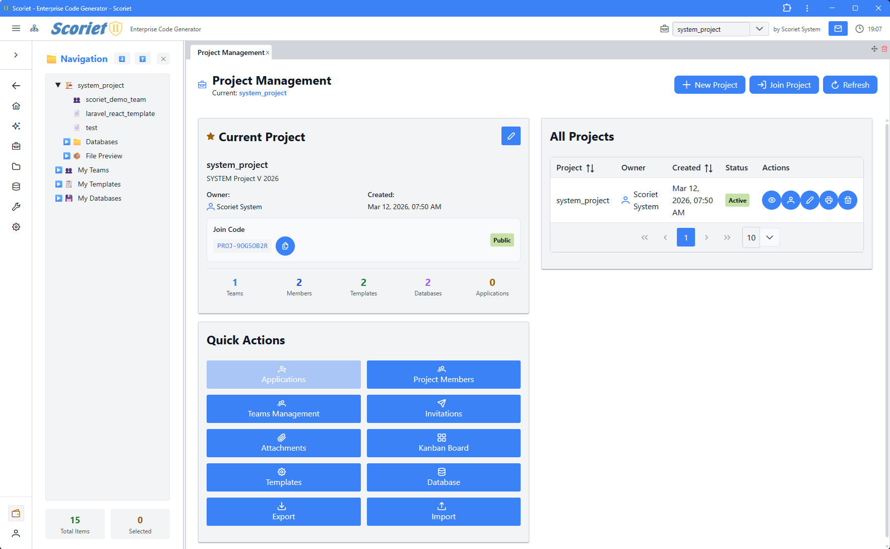 Project overview with project listing table and management actions
ProjectPanel
Project creation and overview.
// Features:
- Create new projects
- Project metadata editing
- Project statistics
- Quick access buttons
ProjectSettingsPanel
Project-level configuration.
// Features:
- Database connection settings
- Default colors
- Grid snap settings
- Language configuration
- Subscription info
TemplateManagementPanel
Template library management.
// Features:
- Template list with search
- Create/clone templates
- Visibility settings (private/team/public)
- Template preview
- Deletion/archiving
TemplateStorePanel
Public template marketplace.
interface StoreTemplate {
  id: number;
  name: string;
  category: string;
  price_type: 'credits' | 'euros';
  price_credits?: number;
  price_euros?: number;
  review_score: number;
  is_purchased?: boolean;
}

// Features:
- Browse templates by category
- Search and filters
- Ratings and reviews
- Purchase tracking
- Price comparison (credits vs euros)
- Download and import
DatabaseManagementPanel
Database schema management and imports.
// Features:
- Import SQL databases
- Schema version management
- Table and field editing
- Constraint configuration
- Export options
ProjectAttachmentsPanel
File and attachment management.
// Features:
- Upload files
- Organize attachments
- Delete files
- File preview
- Access control
4. Collaboration Panels
MessagingPanel
Threaded messaging system.
interface Thread {
  id: number;
  subject: string;
  is_broadcast: boolean;
  messages?: Message[];
  other_participants?: User[];
}

// Features:
- Create new message threads
- Reply to messages
- Broadcast messages
- File attachments
- Read receipts (last_read_at)
- Search threads
- Soft delete for participants
KanbanBoardPanel
Project task management with Kanban boards.
interface KanbanCard {
  id: number;
  title: string;
  priority: 'low' | 'medium' | 'high';
  due_date?: string;
  estimated_hours?: number;
  assignees?: Assignee[];
  labels?: KanbanLabel[];
  comments?: Comment[];
  activities?: Activity[];
}

interface KanbanColumn {
  id: number;
  name: string;
  wip_limit?: number;
  cards?: KanbanCard[];
}

// Features:
- Drag-and-drop cards between columns
- WIP (Work In Progress) limits
- Card priority and due dates
- Assignee management
- Comments and activities
- Role-based visibility (SRM, SDM, Flow Manager)
- Labels and filtering
TeamManagementPanel
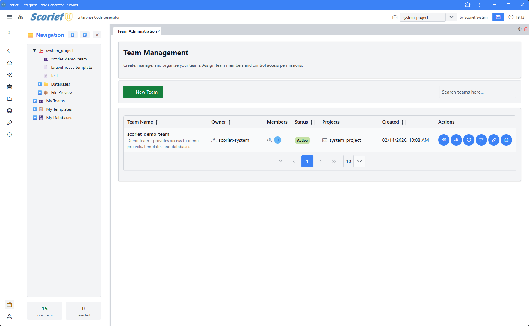 Team Management panel with member listing, roles, and invite functionality
Team member and role management.
// Features:
- Invite team members
- Manage team roles
- Remove members
- Team statistics
- Permissions configuration
TeamRolesPanel
Team role definitions and permissions.
// Features:
- Create custom roles
- Define permissions per role
- Role assignment
- Permission inheritance
InviteManagementPanel
Manage pending and accepted invitations.
// Features:
- View pending invites
- Resend invitations
- Cancel invites
- Accept/decline tracking
5. Code Generation & Development
CodeGenerationPanel
Generate code from templates and schema.
// Features:
- Select template
- Choose schema
- Configure generation options
- Generate code
- Preview output
- Download generated files
DebugManualGeneratorPanel
Manual code generation with debugging.
// Features:
- Debug template execution
- Step through generation
- View variable values
- Log inspection
- Error debugging
CodeAdjustmentsPanel
Post-generation code modifications.
// Features:
- Adjust generated code
- Apply custom modifications
- Save as template
- Version tracking
DeploymentLogPanel
View deployment history and status.
interface DeploymentLog {
  id: number;
  type: 'info' | 'success' | 'warning' | 'error';
  message: string;
  created_at: string;
}

// Features:
- View deployment logs
- Filter by type/status
- Real-time log streaming
- Task status tracking
- Download logs
6. Internationalization Panels
LanguageManagementPanel
Manage supported languages.
interface Language {
  id: number;
  code: string;
  name: string;
  native_name: string;
  is_active: boolean;
  is_default: boolean;
}

// Features:
- Add/edit/delete languages
- Set default language
- Active/inactive toggle
- Sort order management
SchemaTranslationPanel
Translate schema field names and descriptions.
// Features:
- Translate table names
- Translate field labels
- Bulk translation
- Auto-translate via Google API
- Multi-language preview
FieldAssignmentPanel
Assign translatable fields.
// Features:
- Select fields for translation
- Assign to language
- Template management
- Bulk operations
7. System & Admin Panels
SystemSettingsPanel
Global system configuration.
// Features:
- API settings
- Email configuration
- Security settings
- Feature flags
- Maintenance mode
PerformanceMetricsPanel
Application performance monitoring.
// Features:
- Request performance
- Database query metrics
- Memory usage
- Cache statistics
- Chart visualization
PayoutAdminPanel
Seller payout management.
// Features:
- View pending payouts
- Process payouts
- Payment method configuration
- Payout history
- Tax information
CMSAdminPanel
Content management system.
// Features:
- Page management
- Content editing
- SEO configuration
- Preview functionality
CacheDebugPanel
Cache management and debugging.
// Features:
- View cached data
- Clear cache
- Cache statistics
- Debug information
QueryBuilderPanel
SQL query builder.
// Features:
- Visual query builder
- Schema exploration
- Query preview
- Execute and test queries
8. Authentication Panels
LoginPanel
User login interface.
// Features:
- Email/password login
- Remember me option
- OAuth login options
- Error handling
ForgotPasswordPanel
Password recovery flow.
// Features:
- Request password reset
- Email verification
- New password entry
- Confirmation
Panel Props and Context
TabContentProps
Base props for all panels:
interface TabContentProps {
  children?: React.ReactNode;
  style?: React.CSSProperties;
  [key: string]: any;
}
Common Props Pattern
interface PanelProps extends TabContentProps {
  // Data from dock system
  updateTabTitle?: (newTitle: string) => void;
  initialData?: any;

  // Callbacks
  onOpenPanel?: (panelType: string, data?: any) => void;
  onClosePanel?: (panelId: string) => void;
  onRefresh?: () => void;
}
Data Flow in Panels
1. Initialization
Panel Mount → Check Auth → Load Project → Fetch Data
2. User Interaction
User Action → Update Local State → API Call → Show Result
3. Real-time Updates
WebSocket Event → Update State → Re-render Panel
Common Panel Patterns
DataTable with CRUD
const [data, setData] = useState([]);
const [selectedItem, setSelectedItem] = useState(null);
const [editModal, setEditModal] = useState(false);

const loadData = async () => {
  const response = await fetch('/api/data');
  setData(await response.json());
};

const handleCreate = async (formData) => {
  await fetch('/api/data', {
    method: 'POST',
    body: JSON.stringify(formData),
  });
  loadData();
  setEditModal(false);
};

const handleUpdate = async (id, formData) => {
  await fetch(`/api/data/${id}`, {
    method: 'PUT',
    body: JSON.stringify(formData),
  });
  loadData();
  setEditModal(false);
};

const handleDelete = async (id) => {
  if (confirm('Are you sure?')) {
    await fetch(`/api/data/${id}`, { method: 'DELETE' });
    loadData();
  }
};

return (
  <>
    <DataTable value={data}>
      <Column field="name" header="Name" />
      <Column
        body={(row) => (
          <>
            <Button onClick={() => { setSelectedItem(row); setEditModal(true); }}>Edit</Button>
            <Button onClick={() => handleDelete(row.id)}>Delete</Button>
          </>
        )}
      />
    </DataTable>
    <Dialog visible={editModal} onHide={() => setEditModal(false)}>
      {/* Form here */}
    </Dialog>
  </>
);
Form with Validation
import { useForm, Controller } from 'react-hook-form';

interface FormData {
  name: string;
  email: string;
}

const { control, handleSubmit, formState: { errors } } = useForm<FormData>({
  defaultValues: { name: '', email: '' }
});

const onSubmit = async (data: FormData) => {
  await fetch('/api/submit', {
    method: 'POST',
    body: JSON.stringify(data),
  });
};

return (
  <form onSubmit={handleSubmit(onSubmit)}>
    <Controller
      name="name"
      control={control}
      rules={{ required: 'Name required' }}
      render={({ field }) => (
        <>
          <InputText {...field} placeholder="Name" />
          {errors.name && <span>{errors.name.message}</span>}
        </>
      )}
    />
    <Button type="submit">Submit</Button>
  </form>
);
Tab-based Layout
const [activeTab, setActiveTab] = useState(0);

return (
  <TabView activeIndex={activeTab} onTabChange={(e) => setActiveTab(e.index)}>
    <TabPanel header="Tab 1">
      <Component1 />
    </TabPanel>
    <TabPanel header="Tab 2">
      <Component2 />
    </TabPanel>
  </TabView>
);
Error Handling in Panels
const [error, setError] = useState<string | null>(null);

const loadData = async () => {
  setError(null);
  try {
    const response = await fetch('/api/data');
    if (!response.ok) {
      throw new Error(`HTTP ${response.status}`);
    }
    setData(await response.json());
  } catch (err) {
    setError(err instanceof Error ? err.message : 'Unknown error');
  }
};

return (
  <>
    {error && <Message severity="error">{error}</Message>}
    {/* Panel content */}
  </>
);
Performance Best Practices
- Use Suspense - Lazy load panel components
- Memoize Components - Prevent unnecessary re-renders
- Debounce API Calls - Avoid rapid requests
- Virtual Scrolling - Large lists use virtualization
- Lazy Load Data - Pagination for large datasets
- Cache API Responses - Store in localStorage when appropriate
Panel Testing
describe('MyPanel', () => {
  it('should load data on mount', async () => {
    const { getByText } = render(<MyPanel />);
    await waitFor(() => {
      expect(getByText('Data loaded')).toBeInTheDocument();
    });
  });

  it('should handle errors', async () => {
    fetch.mockRejectedValueOnce(new Error('API error'));
    const { getByText } = render(<MyPanel />);
    await waitFor(() => {
      expect(getByText('Error')).toBeInTheDocument();
    });
  });
});
Next Steps
- Components Library - Reusable UI components
- Contexts and State - State management
- Dock Layout - Layout system details